

Flat logos, stripped-back wordmarks, billboards without a brand name: over the past decade, simplification has become one of the strongest trends in branding. Screens got smaller, logos had to work as app icons and favicons, and “less” became the default answer to almost every brief.
But removing details doesn’t always lead to the same result. Some brands come out of it stronger than ever. Others lose the very thing that made them recognisable. So what separates a smart simplification from a damaging one?
Two sides of the same trend
Distinctive brand assets
Marketing science has a name for what makes a brand recognisable at a glance: distinctive brand assets. A distinctive asset can be a colour, a shape, a character, a sound or a slogan. Once the public firmly links it to a brand, it can stand in for the logo itself. That’s exactly what allows some brands to say more by showing less.
“Blanding”
The other side of the trend has been nicknamed “blanding”, from bland. When brands simplify by removing their unique features rather than keeping them, they all start to look the same: clean geometric sans-serifs, flat shapes, neutral palettes. The design press has widely criticised this effect, especially in luxury fashion.
When one code is enough
Here are five brands that pushed simplification very far, without ever losing their audience.
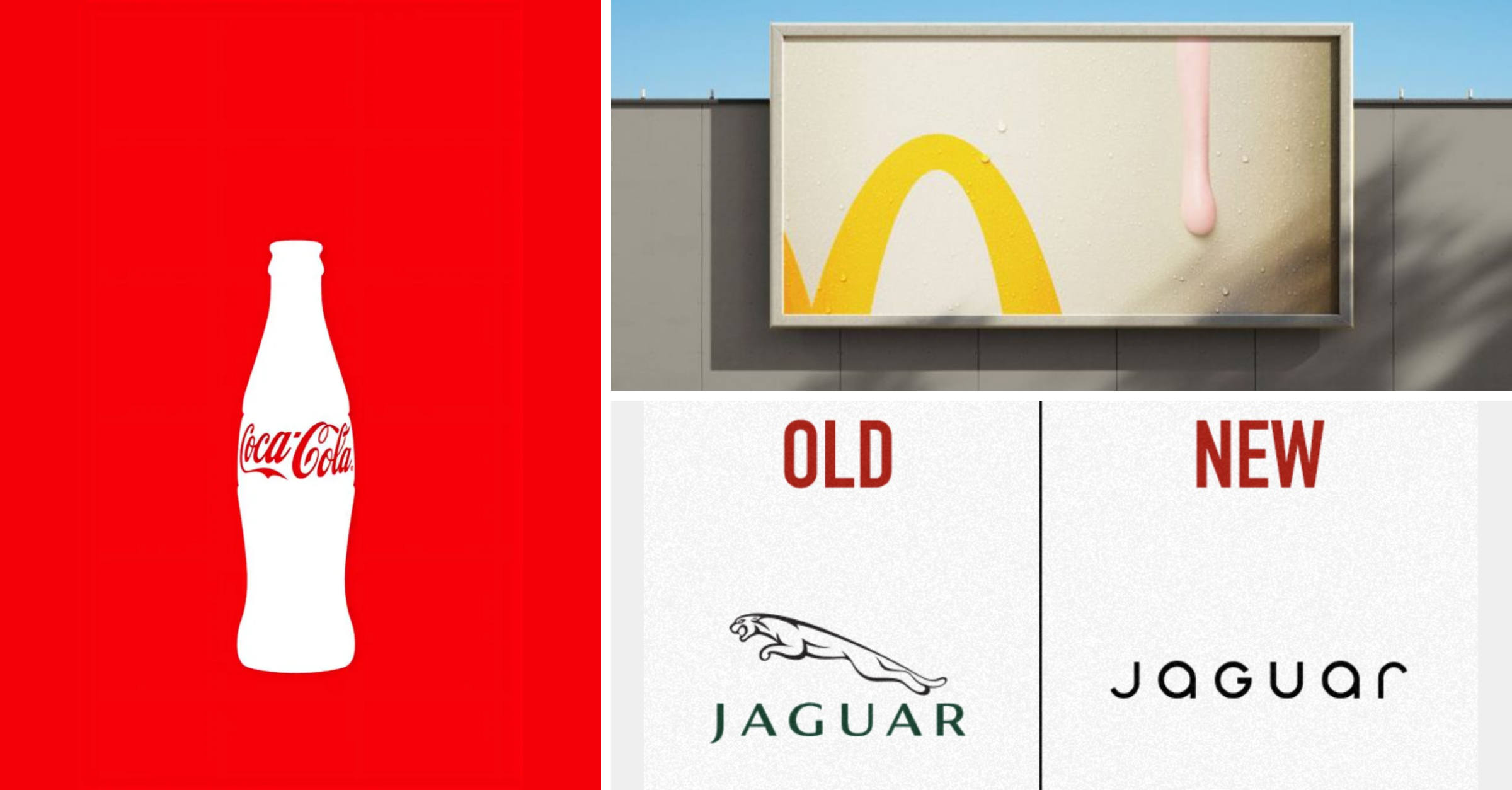
McDonald’s: the yellow arch. McDonald’s has repeatedly run billboards showing only a fragment of its golden arches, or a product in extreme close-up, with no name at all. In Canada, the “Follow the Arches” campaign by Cossette (2018) even cropped the arches to turn them into road directions to the nearest restaurant. People complete the picture themselves.
Heinz: the missing ketchup. In 2017, Heinz and the agency David Miami brought to life “Pass the Heinz”, a campaign originally pitched by Don Draper in the TV series Mad Men. The posters show burgers and fries… with no ketchup and no bottle. The absence of the product is what makes you think of the brand.
The Economist: red. In one of its most famous billboards, a giant light bulb switches on when a pedestrian walks underneath it. There’s no slogan: the red background and a tiny logo are all the signature the brand needs. The colour carries the message.
KitKat: the break. KitKat has turned its “Have a break” line into physical objects, for instance a billboard with a section cut out and a hammock installed inside, inviting passers-by to take a real break. The slogan becomes the brand.
Coca-Cola: the silhouette. The contour bottle, designed in 1915, is so distinctive that its outline alone says “Coca-Cola”. For the bottle’s 100th anniversary in 2015, the brand ran a global campaign built around this shape, with the logo reduced to a minimum.
What these five brands have in common: they remove details, but they keep one strong code that the public already owns.
When simplifying means erasing
Other brands took the opposite route: they simplified by removing exactly what made them unique.
Jaguar (2024): the leaping cat. In November 2024, Jaguar unveiled a new identity as part of its shift to electric vehicles. The famous “leaper” disappeared from the main logo, replaced by a simple wordmark in geometric type, alongside the “Copy Nothing” campaign. The rebrand was widely criticised, by the public and by many in the design and automotive press, for cutting ties with the brand’s heritage.
Cracker Barrel (2025): the old man and his barrel. In August 2025, the American restaurant chain introduced a new logo without its “Old Timer” character, the man leaning on a barrel. Faced with a strong public backlash, Cracker Barrel reversed its decision and brought back the original logo about a week later. A textbook case: the character wasn’t decoration, it was the brand’s real code.
Luxury fashion: unique typefaces. Saint Laurent, Balenciaga, Burberry, Berluti, Balmain: over a few years, many luxury houses replaced their distinctive, often serif logos with similar bold sans-serif capitals. Five houses, five distinctive typographic identities… one almost identical result. It has become the go-to example of “blanding”. Tellingly, in February 2023, Burberry’s new creative director Daniel Lee brought back the Equestrian Knight and a serif wordmark.
The key: keep a strong code
Putting these examples side by side, a simple rule emerges:
You can only remove details if a strong code remains.
Brands that simplify while protecting their code become more recognisable, not less. Brands that remove their code in the name of modernity end up looking generic. Before simplifying an identity, the real question isn’t “what can we remove?” but “what must we absolutely keep?”
Sources
Romaniuk, J. (2018). Building Distinctive Brand Assets. Oxford University Press.
The Fashion Law, Blanding: What Is It, How Did We Get Here?
Adweek, David Miami, Heinz Bring Don Draper’s ‘Pass the Heinz’ Pitch to Life
Creative Boom, Why the Jaguar rebrand failed and what it can teach us
Entrepreneur, Cracker Barrel Is Reversing Its Rebrand